第三章:解锁编程之力:用逻辑与函数生成 CSS
摘要: 在前两章中,我们已经学会了如何编写、组织和复用样式。本章将是您从“SCSS 使用者”蜕变为“SCSS 开发者”的关键一步。我们将把 SCSS 真正作为一门编程语言来使用,深入学习其核心的数据结构(特别是 Map)、控制流指令(@if, @for, @each)以及函数(@function)。读完本章,您将有能力编写出能自我生成、智能适应的样式代码,将重复劳动降至最低,并构建出真正可扩展、系统化的样式系统。
3.1. 核心数据类型与结构
痛点背景: 当项目变大时,我们需要管理的“设计令牌”(Design Tokens)会越来越多,例如,一个品牌有多种主色、多种辅色;一套设计系统有固定的字号阶梯、外边距阶梯。如果将它们声明为几十个独立的 $variable,不仅难以管理,而且无法进行遍历等程序化操作。
解决方案: 使用 Map 来组织这些关联的数据,将它们结构化地存放在 _variables.scss 文件中。
文件路径: scss/abstracts/_variables.scss (新增/修改)
1
2
3
4
5
6
7
8
9
10
11
12
13
14
15
16
17
18
19
20
21
22
23
24
25
|
$theme-colors: (
"primary": #3498db,
"secondary": #95a5a6,
"success": #2ecc71,
"danger": #e74c3c,
"warning": #f1c40f,
"info": #3498db,
"light": #f8f9fa,
"dark": #343a40
);
$spacings: (
"0": 0,
"1": 4px,
"2": 8px,
"3": 16px,
"4": 24px,
"5": 48px
);
$font-stack: Helvetica, sans-serif;
|
3.2. 控制流指令:让样式“活”起来
控制流指令让我们的 SCSS 代码拥有了判断和循环的能力,这是实现样式自动化的核心。
3.2.1. 实战:使用 @if 实现智能文本配色
痛点背景: 当我们创建一个背景颜色可变的组件(如标签、按钮)时,如何确保无论背景是深色还是浅色,文本颜色都能自动调整以保持清晰可读?
解决方案: 创建一个 @mixin,利用 SCSS 内置的 lightness() 函数获取颜色亮度,并通过 @if 指令判断,如果背景色是浅色(亮度 > 50%),则应用深色文本,反之则应用浅色文本。
文件路径: scss/abstracts/_mixins.scss (新增)
1
2
3
4
5
6
7
8
9
10
11
|
@use "sass:color";
@mixin auto-text-color($bg-color) {
@if color.lightness($bg-color) > 50% {
color: #333;
} @else {
color: #fff;
}
}
|
关于 @use "sass:color":这是 2025 年 Dart Sass 的标准语法,用于导入官方的内置模块(如 color, math 等)。这里的 sass: 是必需的命名空间,它代表的是 Sass 这门技术,与旧的 .sass 缩进语法无关。这是 SCSS 现代化模块体系的一部分。
现在,我们创建一个徽章(Badge)组件来应用这个 mixin。
文件路径: scss/components/_badge.scss (新增)
1
2
3
4
5
6
7
8
9
10
11
12
13
14
15
16
| @use '../abstracts/mixins' as m;
.badge {
display: inline-block;
padding: 4px 8px;
font-size: 12px;
border-radius: 4px;
}
.badge-light-yellow {
background-color: #f1c40f;
@include m.auto-text-color(#f1c40f);
}
.badge-dark-blue {
background-color: #2c3e50;
@include m.auto-text-color(#2c3e50);
}
|
文件路径: scss/main.scss (添加导入)
1
2
|
@use 'components/badge';
|
文件路径: index.html
1
2
3
4
5
6
7
8
9
10
11
12
13
| <!DOCTYPE html>
<html lang="en">
<head>
<meta charset="UTF-8">
<title>SCSS @if 智能配色</title>
<link rel="stylesheet" href="scss/main.css">
</head>
<body style="padding: 20px;">
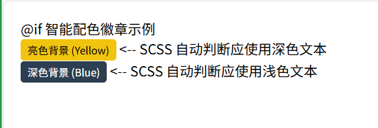
<h2>@if 智能配色徽章示例</h2>
<p><span class="badge badge-light-yellow">亮色背景 (Yellow)</span> <-- SCSS 自动判断应使用深色文本</p>
<p><span class="badge badge-dark-blue">深色背景 (Blue)</span> <-- SCSS 自动判断应使用浅色文本</p>
</body>
</html>
|

智能配色徽章
3.2.2. 循环指令 (@for, @while, @each)
SCSS 提供了三种循环指令,每种都有其特定的应用场景。
@for: 用于执行固定次数的循环,通常与数字索引相关。@while: 在满足某个条件时持续执行循环,使用较少。@each: 遍历 List 或 Map 中的每一项,是迄今为止最常用、最强大的循环指令。
@for 实战:快速生成栅格系统
痛点背景: 我们需要一套 12 列的栅格系统,包含从 .col-1 到 .col-12 的类,手动编写这 12 个类非常重复。
解决方案: 使用 @for 循环,从 1 到 12 动态生成所有列的样式。
文件路径: scss/base/_grid.scss (新增)
1
2
3
4
5
6
7
8
9
10
11
|
@use "sass:math";
@for $i from 1 through 12 {
.col-#{$i} {
width: math.div($i, 12) * 100%;
}
}
|
文件路径: scss/main.scss (添加导入)
1
2
3
4
5
| .col-1 { width: 8.3333333333%; }
.col-2 { width: 16.6666666667%; }
.col-3 { width: 25%; }
.col-12 { width: 100%; }
|
@each 实战:批量生成工具类 (核心实战)
现在,我们回到本章的核心任务:使用最强大的 @each 循环,结合 Map 批量生成工具类。
痛点背景: 我们需要 .text-primary, .bg-primary, .text-danger 等全套工具类。手动编写不仅工作量巨大,而且每当设计系统增加新颜色,就必须手动补充,极易遗漏。
解决方案: 遍历 $theme-colors Map,自动生成所有颜色相关的工具类。
文件路径: scss/base/_utilities.scss (新增)
1
2
3
4
5
6
7
8
9
10
11
12
| @use '../abstracts/variables' as v;
@use '../abstracts/mixins' as m;
@each $color-name, $color-value in v.$theme-colors {
.text-#{$color-name} {
color: $color-value;
}
.bg-#{$color-name} {
background-color: $color-value;
@include m.auto-text-color($color-value);
}
}
|
文件路径: scss/main.scss (添加导入)
文件路径: index.html
1
2
3
4
5
6
7
8
9
10
11
12
13
14
15
16
17
18
19
20
21
22
23
24
25
26
27
28
29
30
31
32
33
| <!DOCTYPE html>
<html lang="en">
<head>
<meta charset="UTF-8">
<title>SCSS @each 生成工具类</title>
<link rel="stylesheet" href="scss/main.css">
<style> .demo-box { padding: 16px; margin-bottom: 10px; border-radius: 4px; border: 1px solid #ddd;} </style>
</head>
<body style="padding: 20px;">
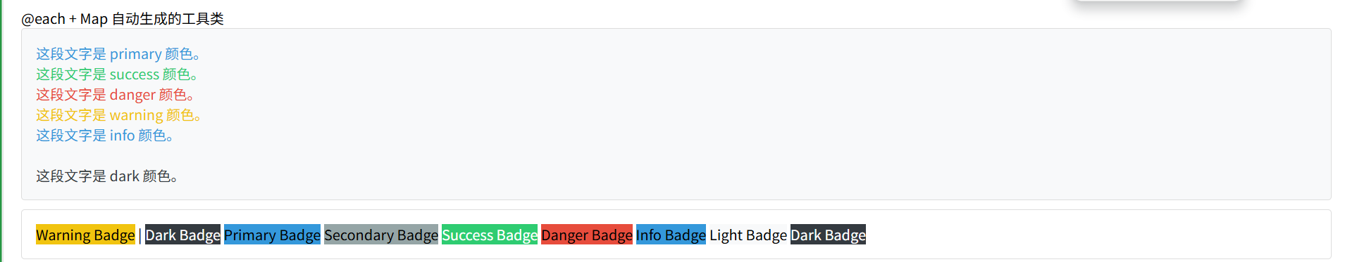
<h2>@each + Map 自动生成的工具类</h2>
<div class="demo-box bg-light">
<p class="text-primary">这段文字是 primary 颜色。</p>
<p class="text-success">这段文字是 success 颜色。</p>
<p class="text-danger">这段文字是 danger 颜色。</p>
<p class="text-warning">这段文字是 warning 颜色。</p>
<p class="text-info">这段文字是 info 颜色。</p>
<p class="text-light">这段文字是 light 颜色。</p>
<p class="text-dark">这段文字是 dark 颜色。</p>
</div>
<div class="demo-box">
<span class="bg-warning">Warning Badge</span> |
<span class="bg-dark">Dark Badge</span>
<span class="bg-primary">Primary Badge</span>
<span class="bg-secondary">Secondary Badge</span>
<span class="bg-success">Success Badge</span>
<span class="bg-danger">Danger Badge</span>
<span class="bg-info">Info Badge</span>
<span class="bg-light">Light Badge</span>
<span class="bg-dark">Dark Badge</span>
</div>
</body>
</html>
|
@each 生成的工具类
3.3. 函数 (@function)
@mixin 用于输出样式块,而 @function 则用于计算并返回一个值。这是两者最核心的区别。
3.3.1. 实战:编写 px 转 rem 的函数
痛点背景: 在现代响应式设计中,我们推荐使用 rem 单位。但设计师提供的设计稿通常以 px 为单位,每次手动计算 px / 16 非常繁琐且容易出错。
解决方案: 编写一个通用的 px-to-rem 函数来自动化这个计算过程。
文件路径: scss/abstracts/_functions.scss (新增)
1
2
3
4
5
6
7
8
9
10
11
12
13
14
15
16
17
18
19
20
21
| @use "sass:math";
$base-font-size: 16px;
@function to-rem($pixels) {
@if math.is-unitless($pixels) {
@return math.div($pixels, 16) * 1rem;
} @else if math.unit($pixels) == "px" {
@return math.div($pixels, $base-font-size) * 1rem;
}
@error "传入的单位不正确,必须是无单位数字或 px。";
}
|
文件路径: scss/main.scss (添加导入)
1
| @use 'abstracts/functions';
|
现在,我们创建一个对比案例,看看使用 rem 的优势。
文件路径: scss/components/_widget.scss (新增)
1
2
3
4
5
6
7
8
9
10
11
12
13
14
15
16
17
18
19
20
21
22
23
24
25
26
27
28
29
30
31
32
33
34
35
36
37
38
39
| @use '../abstracts/functions' as f;
.widget {
width: 300px;
margin-bottom: 20px;
border: 1px solid #ccc;
font-family: sans-serif;
}
.widget-title {
color: white;
padding: 10px;
}
.widget-body {
padding: 15px;
line-height: 1.5;
}
.widget-px {
.widget-title {
background-color: #e74c3c;
font-size: 24px;
}
.widget-body {
font-size: 16px;
}
}
.widget-rem {
.widget-title {
background-color: #3498db;
font-size: f.to-rem(24px);
}
.widget-body {
font-size: f.to-rem(16px);
}
}
|
文件路径: scss/main.scss (添加导入)
1
2
|
@use 'components/widget';
|
文件路径: index.html
1
2
3
4
5
6
7
8
9
10
11
12
13
14
15
16
17
18
19
20
21
22
23
24
25
26
27
28
29
30
| <!DOCTYPE html>
<html lang="en">
<head>
<meta charset="UTF-8">
<title>SCSS @function px-to-rem</title>
<link rel="stylesheet" href="scss/main.css">
<style>
html { font-size: 16px; }
body { padding: 20px; display: flex; gap: 20px; }
.control { position: fixed; top: 10px; right: 10px; background: #eee; padding: 10px; border: 1px solid #ccc; }
</style>
</head>
<body>
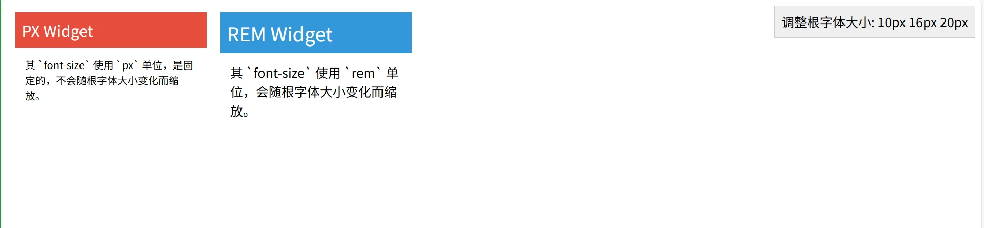
<div class="widget widget-px">
<div class="widget-title">PX Widget</div>
<div class="widget-body">其 `font-size` 使用 `px` 单位,是固定的,不会随根字体大小变化而缩放。</div>
</div>
<div class="widget widget-rem">
<div class="widget-title">REM Widget</div>
<div class="widget-body">其 `font-size` 使用 `rem` 单位,会随根字体大小变化而缩放。</div>
</div>
<div class="control">
<label>调整根字体大小:</label>
<button onclick="document.documentElement.style.fontSize='10px'">10px</button>
<button onclick="document.documentElement.style.fontSize='16px'">16px</button>
<button onclick="document.documentElement.style.fontSize='20px'">20px</button>
</div>
</body>
</html>
|
PX vs REM 响应式对比
操作提示: 点击页面右上角的按钮改变根字体大小。您会发现,“REM Widget” 的所有文字大小都会等比缩放,而 “PX Widget” 则毫无变化。这就是使用 @function 封装 rem 计算带来的巨大维护性和灵活性优势。

)